Library / study
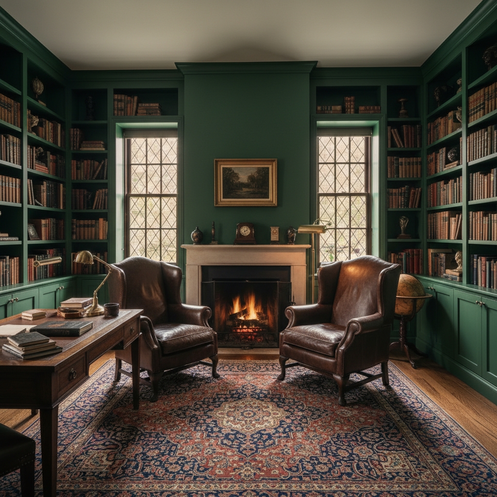
Greenwich study
- Palette / surface
- Deep green built-ins with quiet warm trim
- Prep concern
- Edges, shelves, and sheen need to hold up close.
- Why it matters
- A dark room succeeds when it feels intentional, not heavy.
Work
A premium painting portfolio should show more than finished color. These studies frame palette, surface, preparation, and the reason each decision matters.
Portfolio approach
Each study is organized around what a homeowner actually needs to understand: palette, surface, preparation concern, and why the finish matters in the room or exterior.
As photographed client work grows, this page can turn each study into a deeper project story without relying on before-and-after theater.
Portfolio studies
Library / study

Colonial exterior
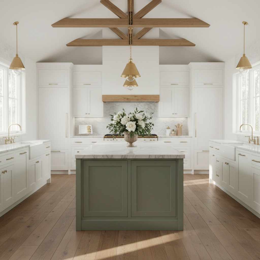
Kitchen cabinetry
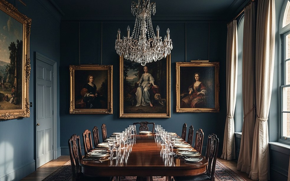
Dining room / millwork

Powder room
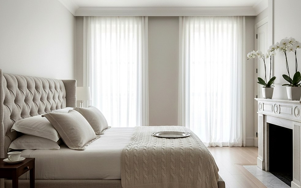
Bedroom / plaster walls

Trim and casing

Color consultation
What to notice
Look past the color first. The real signals are surface condition, trim detail, edges, natural light, fixed finishes, and whether the palette feels like it belongs to the house.
Those are the details we want the consultation to surface before a scope is written. A beautiful final photograph is easier when the preparation and decisions were handled calmly.
Book consultation
Share the neighborhood, the rooms or exterior, and the best way to reach you. We will prepare the next step without pressure.
Prefer email? hello@chipandtuck.com